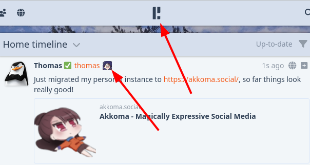
Just did my first post on the new platform.
The default icon seems a bit too busy for me, too small for all the detail, same for the browser favicon in my opinion. Did you consider a capital A in the style of the Pleroma logo?
I would do it and share if I knew how to create the artwork.
If there is interest I could maybe ask someone to create it?
see Aesthetics: what to do even?
we still need to figure out something that’s distinct enough from literally just akko
maybe a purple witch’s hat? maybe it’s resting on top of an A?